Product Redesign
Transforming a complex logistics platform into a clearer, more scalable experience.
A product redesign focused on simplifying complex workflows, improving information hierarchy, and creating a reusable design foundation.
Role & Ownership
Product Designer · Design leadership
Scope
UX Research · UX/UI Design · Product Redesign · Design System · Theming
Duration
~3-4 months
Product
Tracking Management System
Team
CTO · APM · Designers · Frontend Developers · Backend Developers
Overview
The Tracking Management System supported core logistics operations across orders, shipments, tracking, and operational management.
As the product evolved, inconsistencies across screens and complex workflows made the experience increasingly difficult to navigate.
The redesign focused on simplifying these experiences while creating a reusable design foundation that could support the product as it continued to grow.
This redesign was approached as a product-wide transformation rather than a collection of individual screens. Working directly with the CTO, I helped shape the design direction across complex logistics workflows while establishing a reusable design foundation for the broader product.
As the initiative expanded, I also onboarded junior designers, assigned them areas of the product, and reviewed their work to maintain consistency across workflows and the evolving design system.

The Challenge
A complex product that needed more clarity and consistency.
The existing product had grown across multiple operational workflows, resulting in inconsistent interfaces, dense information, and usability challenges.
The challenge was to improve the experience without losing the familiarity existing users relied on.
Rather than treating each screen as an individual redesign, I approached the product as a connected system - looking at information hierarchy, reusable patterns, workflows, and the underlying design foundation.
.png)
.png)
Design Approach
Redesigning the product as a system.
The redesign focused on four key areas:
Simplify
Reduce visual complexity and make important information easier to find.
Structure
Create clearer hierarchy across workflows and information-heavy screens.
Systemise
Establish reusable components and patterns instead of designing each screen from scratch.
Scale
Create a flexible foundation that could support new screens, configurations, and themes.

Building The Design Foundation
Creating reusable foundations for the redesigned product.
As the redesign expanded across the platform, consistency became increasingly important.
I helped create and largely led the design system, establishing reusable components and patterns that could be adapted across different product experiences.
Instead of recreating each screen from scratch, the system provided reusable structures that could be configured according to the requirements of each experience.
.png)
01 : Reusable pattern
A common page structure that could be reused across different experiences
.
02 : Configurable content
The main content area could be replaced based on the requirements of the screen.
03 : Component properties
Components could be configured without rebuilding the underlying structure.
Orders
Making operational information easier to scan.
The Orders experience contained multiple pieces of information that users needed to review and compare quickly.
The redesign introduced a clearer hierarchy for order information, making key details easier to scan within the list
BEFORE

AFTER
Outcome & Impact
-
Centralized operational visibility across multiple business functions
-
Improved access to real-time performance insights and KPI monitoring
-
Simplified analysis of complex logistics data through structured visualization
-
Enabled faster and more informed decision-making across teams
-
Enhanced workflow efficiency through centralized monitoring systems
-
Established a scalable dashboard framework for future operational reporting
Create Order
Structuring a complex workflow into clearer sections.
Creating an order required users to enter a large amount of information across different parts of the workflow.
The redesign organised the experience into clear sections including General Details, Order Details, Delivery Details, and Pickup Details.
This created a more structured and manageable form experience.
BEFORE

AFTER
Order Details
Bringing complex information into a clearer hierarchy.
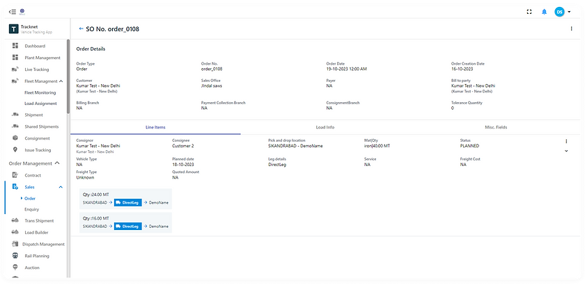
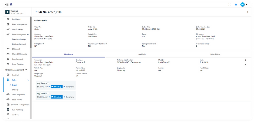
Order Details brought together information across order status, tracking history, cargo, shipments, custom fields, and activity.
The redesign created clearer separation between these information groups, helping users understand the state of an order while keeping supporting information accessible.
BEFORE
.png)
AFTER
Shipments
Making shipment status easier to understand at a glance.
The Shipments experience combines operational information such as shipment status, tracking source, route, delivery status, EDD, and remaining distance.
The redesign brought these details into a more structured list experience, making shipment progress and exceptions easier to identify.

BEFORE
.png)
AFTER
Control Tower
Improving visibility across ongoing operations.

BEFORE
.png)
AFTER
Theming with Variables
One system, multiple themes.
I created light and dark modes using a variable-based approach within the design system.
This allowed the same interface structure and components to adapt across themes while maintaining consistency throughout the product.

LIGHT | DARK


Outcome & Impact
A stronger foundation for a complex product.
The redesign transformed fragmented and inconsistent experiences into a more structured product ecosystem while establishing a scalable foundation for future development.
-
Improved consistency across core product experiences
-
Reduced order creation from a single dense form into 4 clearly grouped sections (General, Order, Delivery, Pickup), cutting down back-and-forth corrections during entry
-
Established reusable components and patterns
-
Onboarded and reviewed work for 2 junior designers, maintaining consistency as the system scaled
-
Design system adopted across multiple screens/modules by the broader team, replacing one-off screen builds
-
Introduced variable-based light and dark theme
Redesigning complexity into a clearer, more scalable product experience.
Product Design · UX/UI · Design Systems · Theming